Signup forms should be placed such that it’s impossible for a user to miss and you will automatically see an Increase in User Signups.
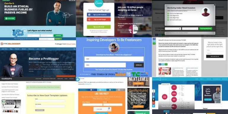
Traffic is the lifeline for websites. Every webmaster aims to get as many users and traffic as possible.
As a webmaster, you get a lot of people to visit your site but how many of them remember you?
Take the flip side of it, how many websites you remember that you have visited today or visited in the last hour?
You can name those few big websites but nothing after that.
As a webmaster, you have to make sure visitor remember your website and revisit your site when you have more products to offer them or have content that may be useful for them. Help visitors by allowing them to be part of your website for more than just a glimpse of what they saw on their first visit. If you want visitors to frequently revisit your site, grab their email and send them notifications of what you have on offer for them.
1. Signup forms instead of signup links
Registration links are so old and outdated. Place a registration form instead of registration buttons that ask the user to visit a new page to sign up or subscribe.
It can be too much of pain for the user to click the signup button and then fill out the sign-up form. Remove pain points from the signup form to increase sign-ups.
2. Keep signup process short
You don’t need to make each and every detail mandatory for the user to sign up.
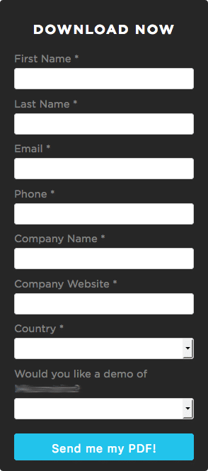
Most of the details can be asked at a later stage of the signup process and after the user confirms the email.
3. Incentivize Signups
Provide a reason to signup.
- Subscriber-only benefits.
- A lead magnet like a free eBook.
- Ad-free website experience.
- A report in PDF format.
A more lucrative reason to signup always helps.
4. Prominent placement of signup forms
Signup forms should be placed so it becomes almost impossible for a user to miss it.
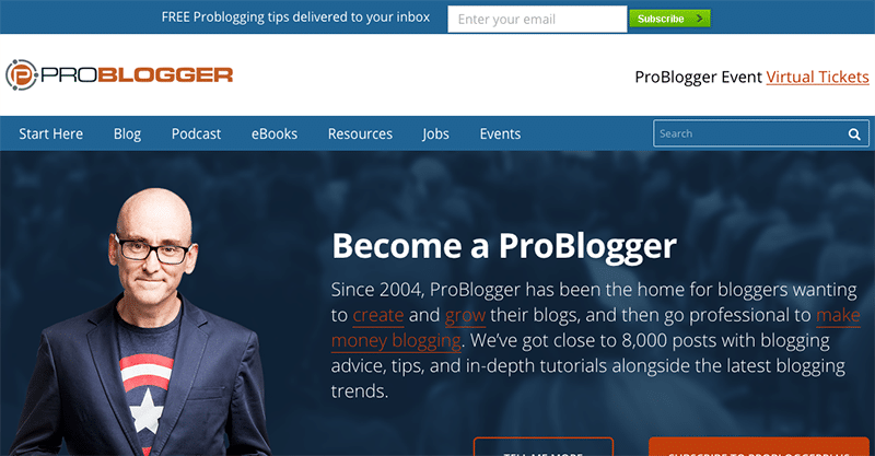
1. In the header
You need your form to be super sleek to be able to add it in the header. Having too many fields can be a killer but if you have only email or name and email, you can place it in the header and Increase User Signups.
2. Above the fold
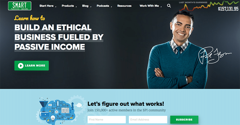
No matter how big your header graphic is, signup forms should always be above the fold if you want to users to signup.
3. Within the content
Instead of asking people to subscribe to download the content, you can have placed the subscribe form very near to the download link.
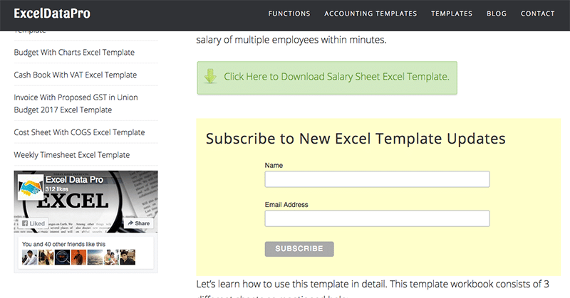
4. After the content
The reader has read everything that you wanted him to read and is ready to take an action. Why not ask the reader to subscribe and Increase Signups?
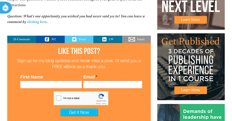
5. In the sidebar (Floating)
Your social media icon aren’t the only thing that can float with the content. The sidebar may not be as tall as the content and often space is wasted. You can use q2w3 fixed widget plugin in WordPress to make subscription widget float.
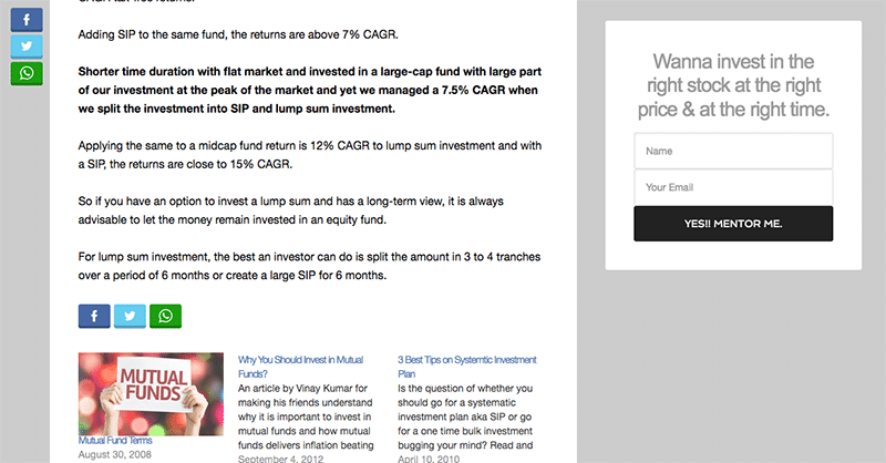
6. In the Footer as Fly-in or Slide up forms
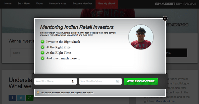
If you want to Increase User Signups, the forms sliding from the bottom is quite effective. I have created WordPress plugins for such footer slide-up.
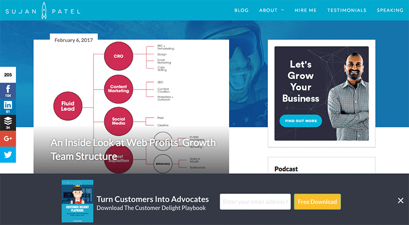
7. Exit intent popup forms
When a user is about to close the tab, show them an option to subscribe and Increase user signups to your list.
5. Have a landing page
Each of your post on the blog becomes your landing page but that should not stop you from having a squeeze page where you offer a unique value proposition for a user to sign up.
The landing page can be promoted in many different ways like advertising or you can collaborate with other bloggers to send traffic to landing pages.
The about page or start here page can be a landing page. Last but not least, treat the homepage as a landing page.

6. Include social proof
Humans by default like to follow. The fear of the unknown is very deep-rooted in our genes.
Include social media followers as well as any other media appearance that can help people to feel confident about you and your website when they sign up.
7. Advertise
If you are trying everything without paying Facebook or Google, you are doing it all wrong.
You can do it all without paying but having a budget for advertising is a must for any business and your web business is no different.
Drive people to key landing pages with advertisements and track user experience to optimize for sign-ups.
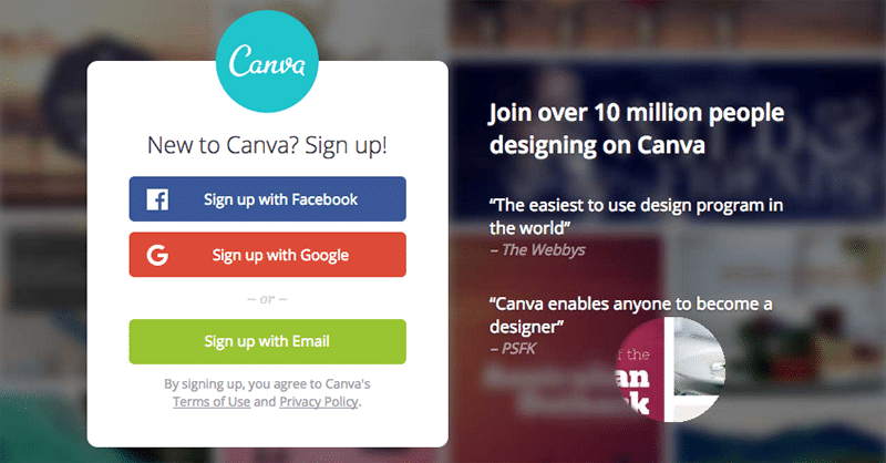
8. Allow Signup with Social Media
As an when possible allow users to sign up using social media as it eradicates the need to enter details again for a user and removes the need for an email confirmation.
9. Optimize Signup For Mobile Devices
Web-users on mobile are growing like anything. Every webmaster should make sure the website is optimized for mobile devices and the signup process on a mobile device is seamless as well.
10. Organize a contest
Organize a contest on social media for users who refer other users win a prize. It can help drive a lot of subscribers and registered members. This can be a double-edged sword and you may see a lot of fake signups.


