The best performing Google Adsense Banner sizes along with its placement to help you maximize earnings via Adsense

Which is the best performing Google Adsense banner size? What should be the ideal placement of the better-performing banners? With so many choices of banner sizes, testing each for performance can be a daunting task.
Adsense still is predominantly a Pay Per Click ad network. You get paid for clicks. Having ads in a position that isn’t too intrusive for the readers and getting clicks is ideal for a webmaster or blogger.
I have tried and tested various banner sizes on my blogs and forums to determine which formats work best. As a result of my tests, I have found some top-performing Google AdSense banner sizes and ad formats. They have been consistently offering excellent results to my earning in Adsense and making a living blogging.
Hence, let me help you understand how to place Google Ads to maximize revenue, and readers don’t get the feel of too many ads.
Why Some AdSense Banner Sizes Perform Better?
Google Adsense is an auction marketplace. Advertisers bid predominantly for clicks and, to some extent, for impressions. To maximize the webmaster’s earnings, Google intelligently places ads related to the page content or user interest.
Moreover, Adsense offers a variety of banner sizes and ad formats to advertisers right away. On top of that, Google also brings in other ad networks to compete along with its advertisers.
So, if some Adsense banner has more advertisers than others, it is bound to perform better.
Similarly, some ad sizes tend to fit well within the design. Google ads integrated well within the design has more chances of higher CTR. However, in some cases, when the ads stand out, they can have a better CTR and can impact earnings.
So the first thing you need to look for is an ad size that gathers lots of advertisers’ interest in Google Ads and external participating ad networks.
Second, the ad size must not hinder the user’s browsing experience and blend well within the website design. In other words, the ad size must not be too small to go unnoticed and too large to offend the user.
With so many choices, no one option fits all. So I have made three sections.
Best Google AdSense Horizontal Banners
Let us look at the best Google Adsense horizontal banners.
1. Responsive Horizontal
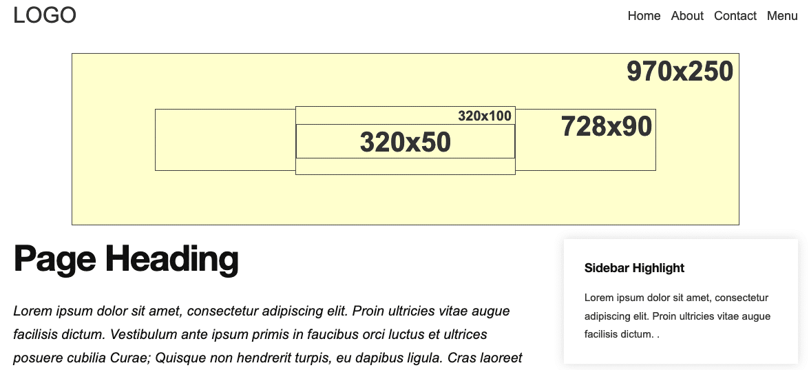
The horizontal responsive banner has to be the best performing Google Adsense square banner. As the name suggests, the banner is responsive and adapts itself to show the best ad available for Adspace. Moreover, the best position is in the header, making it an even more lucrative Adsense size.
In the illustrative example image, I have shown 970×250, 728×90, and mobile banner sizes like 320×100 and 320×50 are some of the standard banner sizes seen within the responsive horizontal ad. With a broader screen size, even 1280×280 banner sizes are part of the responsive ad unit, making it the best performing Adsense banner.
The square banner of size 300×250 can also fit into space, but it is not a very common placement for Google in a horizontal responsive banner size.
Because the ad on desktop and the larger resolution becomes very big right at the top, some people prefer it in the footer and have a non-intrusive user experience.
2. The billboard (970×90)
The billboard is a wide horizontal banner ad format. The ideal placement is either on top or at the bottom of the site pages. It’s usually a brand-centric ad format. The exciting part about the 970×90 billboard is you get better ads because of the vast space. Additionally, billboard integrates image, textual, and video ad contents giving better revenue for the webmasters.
The only caveat with using 970×90 ad is that you have to deal with loading different ad sizes based on the user’s screen size as it is a fixed-sized banner.
3. The leaderboard (728×90)
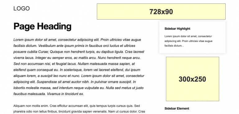
The leaderboard 728×90 is suitable for site headers. As a traditional ad banner, this format is the preferred ad size among advertisers. Moreover, in Adsense, it integrates both textual and image ads for advertisers.
However, for mobile screens, one has to load either 320×100 or 320×50 banner sizes. The best part is it has a better ad inventory than other formats because it is a widely accepted ad unit across all ad networks.
The best placement of the leaderboard is in the header and typically beside the logo. It tends to get excellent visibility and earns better revenue for the webmaster. Moreover, for 970×90 for smaller screen sizes like tablets and iPads, it is advisable to load a 728×90 leaderboard.
The leaderboard ad format is highly recommended because of its size and wide acceptability.
4. Large Mobile Banner (320×100)
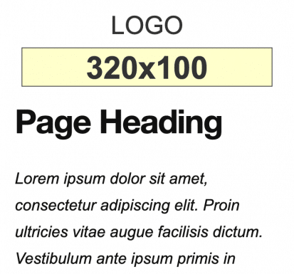
The name large mobile banner itself speaks that it’s a mobile ad format. On performance metrics, the large mobile banner is similar to the leaderboard ad format we discussed above. In short, you can term a large mobile banner as a leaderboard but for mobile devices only.
The ideal placement is precisely below the header. Now that we know websites get massive traffic from mobile devices, this ad format has a high earning capability. Since it is on the top below the header, the advertiser receives rich ad inventory.
5. Mobile Leaderboard (320×50)
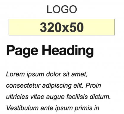
The mobile leaderboard 320×50 is typically for those who don’t want to push the content on mobile devices too much lower and still want to show an ad above the fold. It’s half the size of a large mobile banner in terms of height.
There are two takeaways from the mobile leaderboard. First, the Ad experience is good, and second, it is less disruptive. Users browsing on mobile devices is an added advantage here. Hence, this ad format is advisable if you have good mobile traffic, want to have an ad in the header but don’t want too many ads right at the top.
Best Google AdSense Square Ads
Let us look at the best Google Adsense square banners.
1. Responsive Square
The responsive square banner has to be the best performing Google Adsense banner. As the name suggests, the banner is responsive and adapts itself to show the best ad available for Adspace. The best position for square ads is within the content, but it is the sidebar’s preferred choice of banner.
In the illustrative example image, I have shown 336×280, 300×250, 250×250 and 200×200.
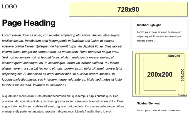
The best part of the responsive square banner is, it adapts to the available width. So if the design only allows 300px width, it will show the better performing ad of 300×250, 250×250, and 200×200. The 336×280 will be discarded.
2. Fixed Size Medium Rectangle (300×250)

The medium rectangle (in-content ads) ad size is a comfortable fit. The sidebar is an ideal place to use this banner. Additionally, it supports both display and text ads on desktop and mobile layouts. The best part about using a medium rectangle is it merges with the design.
The main reason for using a 300×250 medium rectangle is it mixes well with the content. It has the best CTR rates as per my experience.
It is a natural tendency to think that large banner ads give huge earings. And this is the big reason why people suggest 336×280 over 300×250. The reality is a bit different.
The medium rectangle (300×250) is much more prevalent among advertisers, especially among the CPM ad networks. In Adsense, you can opt for Google certified CPM Ad network ads.
Hence, if you have 300×250 on your website, you may have more advertisers to compete for an ad view. As a result, you get higher returns. You can experiment and test both medium & large rectangle to see which ad unit performs better for you and vice versa.
Adsense is not the only Ad network I use. The other system prefers 300×250. It is one of the main reasons I prefer 300×250 ad units more than 336×280. Apart from that, I personally like 300×250 integrated into the design more than 336×280 because it later looks less professional to me.
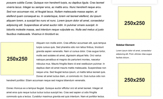
3. The Square (250×250)
The square ad format is flexible and can easily fit into your site layout. The ideal placement is on the sidebar, but it performs best when it is above the fold within the content.
Advertisers have a notion that large ads grab more visibility, but that’s not the case. 250×250 is small in size and still performs better because of its adaptability within the content and fits well with the site design layout.
4. Large rectangle (336×280)
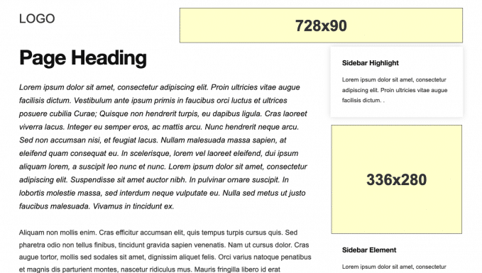
The 336×280 ad size is large and gets easily noticed by visitors. So advertisers prefer it.
However, there’s a backdrop of using a large rectangle if the sidebars are narrow one can’t fit in 336px wide ad.
Best Google AdSense Vertical Banners
Let us look at the best Google Adsense vertical banners.
1. Responsive Vertical
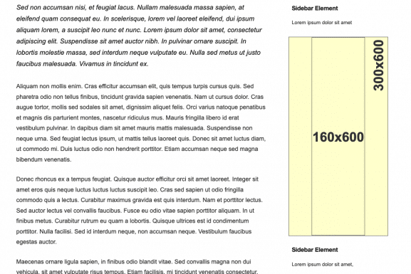
The vertical responsive banner has to be the best performing Google Adsense vertical banner. The best position for a responsive vertical ad unit is in the sidebar.
In the illustrative example image, I have shown 300×600, 160×600.
2. Half Page aka Large Skyscraper (300×600)
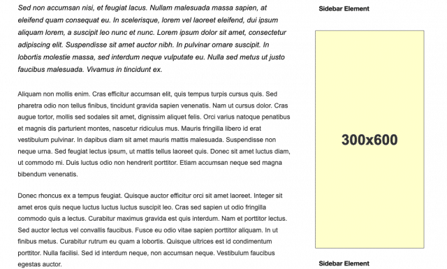
The large skyscraper banner is wide in size vertically. And that’s the reason why it is famous as a half-page among advertisers. It drives better ad revenue because it gives more exposure to the advertiser’s brand or products.
3. Skyscraper (160×600)
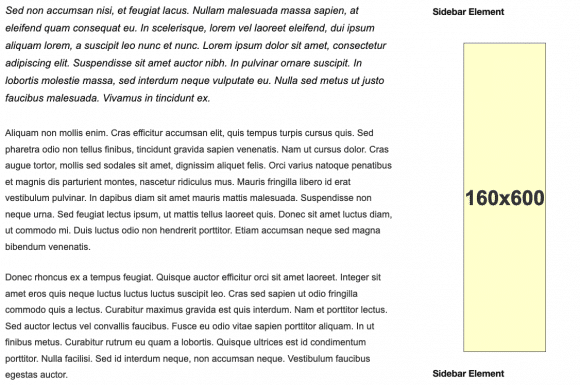
If you have a narrow sidebar, then skyscraper is the best fit. The 160×600 banner size is for site themes having narrow sidebars. The ad format supports both text and image ads, but predominantly, it contains image ads only.
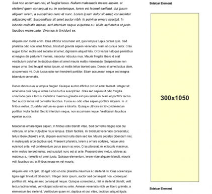
4. Portrait (300×1050)
The portrait ad format is the longest vertical banner out of all in this list. Not only long but 300×1050 is wide enough to display image ads correctly.
The portrait is famous among brand-oriented advertisers because of the ad space it carries.
The best placement is either beside the content or in the sidebar. This way, publishers can gather more visibility and clicks.
Final Thoughts
Please don’t take my words for granted. Every website in every niche is different. Moreover, your site visitors and readers are different from mine. So it is wise to experiment with different sizes. The one that has more advertisers will generally tend to do well for sure and start testing where you can assume to have more advertisers.
Don’t be surprised by the results. The best Adsense revenue comes to those who are willing to experiment with sizes and placement.

