Navigation menu in Shopify varies with the theme. The selection of theme for the Shopify store should be based on how well they use the menu on mobile devices.
Understanding the working of navigation menu in Shopify is essential to be able to get the customers to find products while browsing the store. The navigation menu remains the same, but each theme may use it differently or different devices. So it is essential to set up the navigation menu right once and for all.
How to Set Header and Footer Navigation Menu in Shopify?
Click navigation under online store on the left panel. The navigation screen will appear. Here sellers can view and edit both header and footer menu items.

In the image above, I have already set both of them. The different store pages I created have pinned them in the footer menu.
Whereas, the main menu has four items viz Home, About Us, Products, and Contact.
How to Add/Edit Items in Main Menu (Header)?
Among the essential features of online store design, navigation is one of them. One must integrate categories or pages in the main menu, whereas less critical links into the store footer.
To add or edit items in the main menu aka header, click the add menu item. Instantly, a window will pop-up asking the seller to fill in the menu item details.
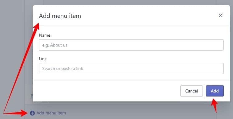
After inserting name and link click add button. Doing this will add a new page or item.
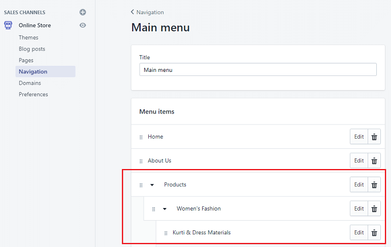
Additionally, I have created a nested menu to fit sub-categories under the main category. For example, Products >> Women’s Fashion >> Kurti & Dress Materials.
Sellers can create a drop-down menu by simply drag and drop method. Hold the item with small dots on the far left and drop it under the desired one.
How to Add/Edit Items in Footer Menu?
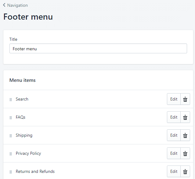
Adding menu items in the footer works the same way as we discussed above for the header. Shopify offers an easy drag and drop interface to create intuitive menus.
One can apply changes using the edit buttons or delete an item using the bin button.
Preview
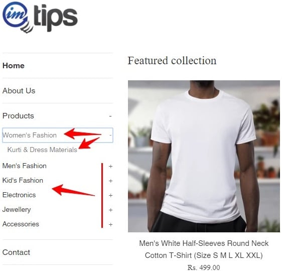
In the above image, the Navigation Menu for my Shopify store is visible. The nested items will show up once customer clicks on the plus sign. Hence, this is how one can add, edit, or delete menu items in the navigation.
Depending on the store theme the main menu is either visible as header menu, or an item list in the sidebar. The same is with the footer menu. It usually displays as items across the width of the footer.
How Does Navigation Change with Themes?
Setting up a menu isn’t difficult in Shopify, but one has to understand how the navigational menu can impact the Shopify store.
The Simple theme in Shopify has the main menu on the left side on the desktop. However, on mobile, it takes a considerate space in the header.
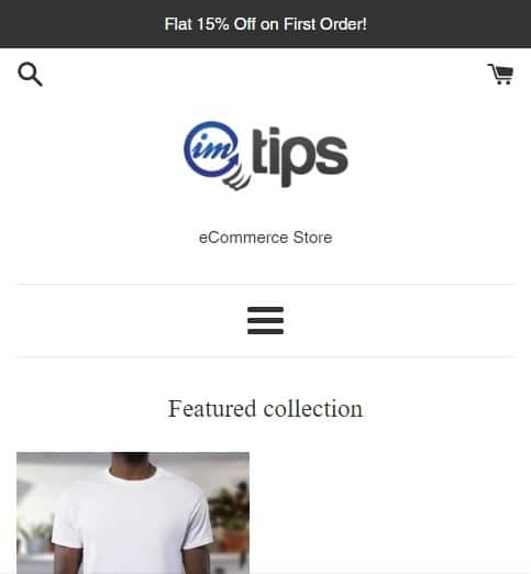
While browsing the store on a mobile device, the collapsed menu along with tagline covers a large part of the screen.
Supply, another Shopify theme displays the main menu horizontally on desktop.

Whereas, on the mobile device, the main menu collapses and shifts on the left. Besides, the cart button aligns with the collapsed main menu. Refer to the image below.
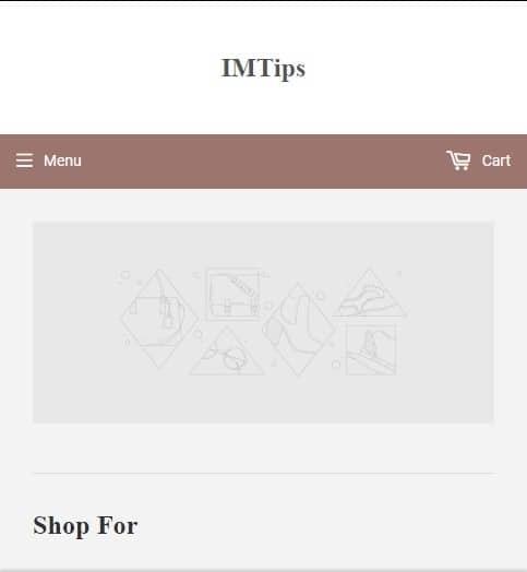
Slight better user experience.
But, when the main menu is open, it covers the whole screen.
Now, let us see a remarkable example of easy navigation using Porto Shopify theme.
The main menu is on the left side, just like our Simple theme.
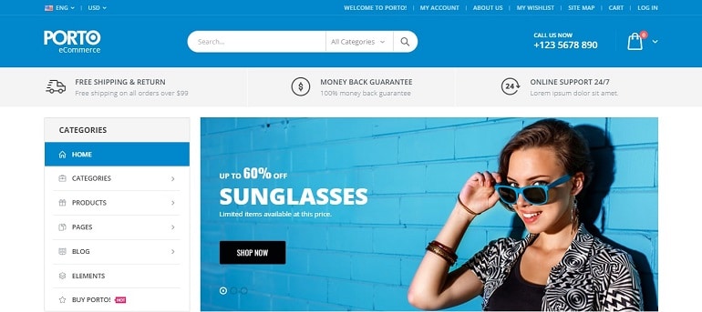
However, on the mobile screen, it becomes more enticing. The main menu collapses beside the logo. The menu, logo, search, and cart icons placed in a single line gives more space to content.
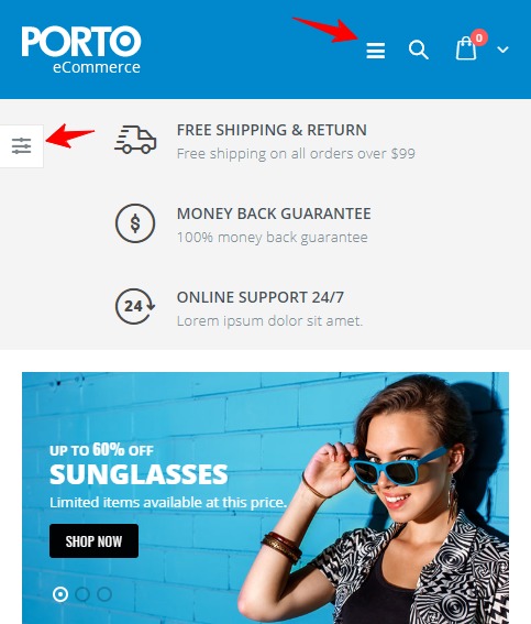
Moreover, the main menu is like the Google Play App Store Menu sliding from the left.
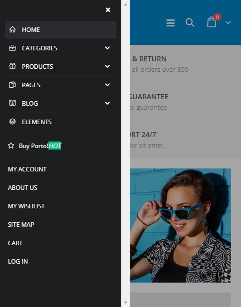
The navigational menu doesn’t hinder the view.
The bottom line is – choose navigation wisely that is not only responsive but also user-friendly.
